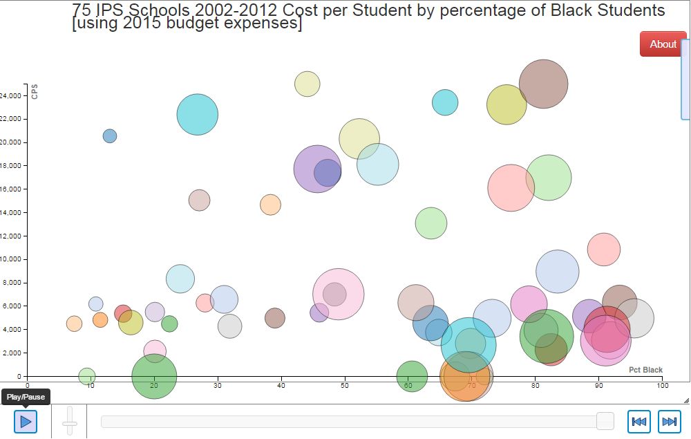
The Motion Bubble Chart that best visualizes the relationship between funding for Black students and their schools is the chart labeled "All 75 Schools". In this chart the X axsis is the percentage of Black students in that year, the Y axsis is the Cost Per Student (including "Central Office" expenses) The slider at the bottom is used to view the chart for each individual year. The size of the bubble is determined by the Total Cost. Explore Cost per Student data for all 75 Schools
Let's look at those schools whose maximum percentage of Black students falls above 50%.
Now, let's look at those schools whose maximum percentage of Black students never exceeds 50%.
And finally, let's look at some selected schools........
to recap